The Winners of the World Dataviz Prize 2023 — Information is Beautiful
The results are in! After combing through hundreds of impressive, insightful and inventive entries, we’re proud to announce the winners of the World Data Visualization Prize 2023.
Conducted in partnership with the World Government Summit, the competition this year focuses on the past, present and future of society and governments. We asked entrants to use the power of data-visualization to illuminate data on the innovations, decisions and metrics that can be used to drive and measure progress.
Scroll through these interactive and static ‘poster’ entries to see who took the grand prize of $25,000.
Interactive Third Place – $2,500

This interactive dashboard uses AI and vivid colours to visualise the sustainability performance of countries based on human, health, environmental, economic, and political conditions. Toggle between different modes to uncover interesting patterns about the current state of our world. By Supawich Orian and Palm Jumnongrat
Interactive Second Place – $5,000

Hooking us with an interactive scrolly-telling guessing game, this playful piece reveals and challenges the assumptions people make around key health, the environment, and education metrics. By Beatriz Malveiro and Rita Costa
Interactive Winner $7,500

This beautifully elegant visualisation uses the metaphor of a tree in different seasons to spotlight different aspects of progress. Hover over the branches to understand the present, the roots to see the past, and the sky to learn about the future. By Liuhuaying Yang
Honourable Mentions
Cited by the judges
» Divided World (Roman Bunin)
» Globoscope (Patrick Obumselu)
» Earth Carillon (Matteo Palu)
Poster – Joint 3rd Place – $1,000

This intriguing, colourful infographic folds in data from NASA, the IPCC, and the World Bank to showcase positive improvements from the last 10-years while also highlighting areas of decline or slow growth. By Jamie Harris and Linaka Greensword
Poster – Joint 3rd Place – $1,000
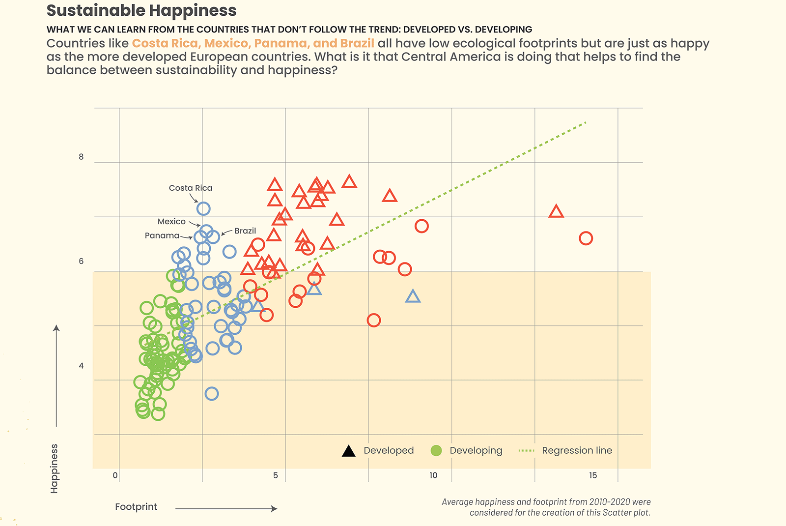
Do the countries we traditionally define as the happiest also make our environment happy? And is consumption causing net negative or net positive happiness? This poster addresses these questions with incisive graphics. By Qingyue Li and Enrique Mendoza T.
Poster 2nd Place – $3,000

This clarifying infographic challenges the pessimism of progress. By representing change in a “grade” for 5 different categories, you can see what metrics are tending in a positive or negative direction over the last decade. By Emily Murphy
Poster Winner – $5,000

Stark black and white imagery shines a light on electricity and energy consumption and production across the world in a intriguing unfolding journey. By Rafael Höhr
Honourable Mentions
Cited by the judges
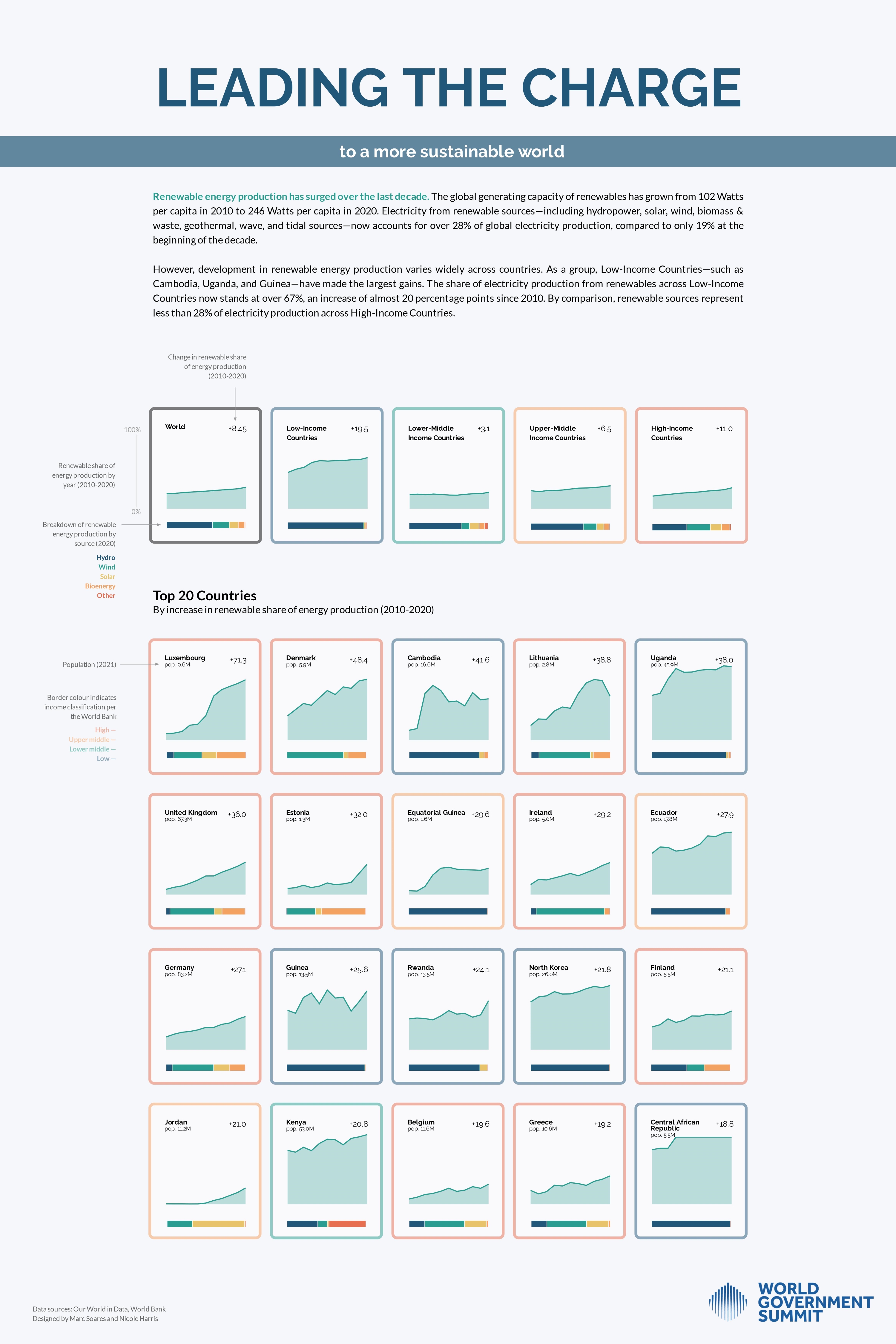
» Leading the Charge to a More Sustainable World (Marc Soares & Nicole Harris)
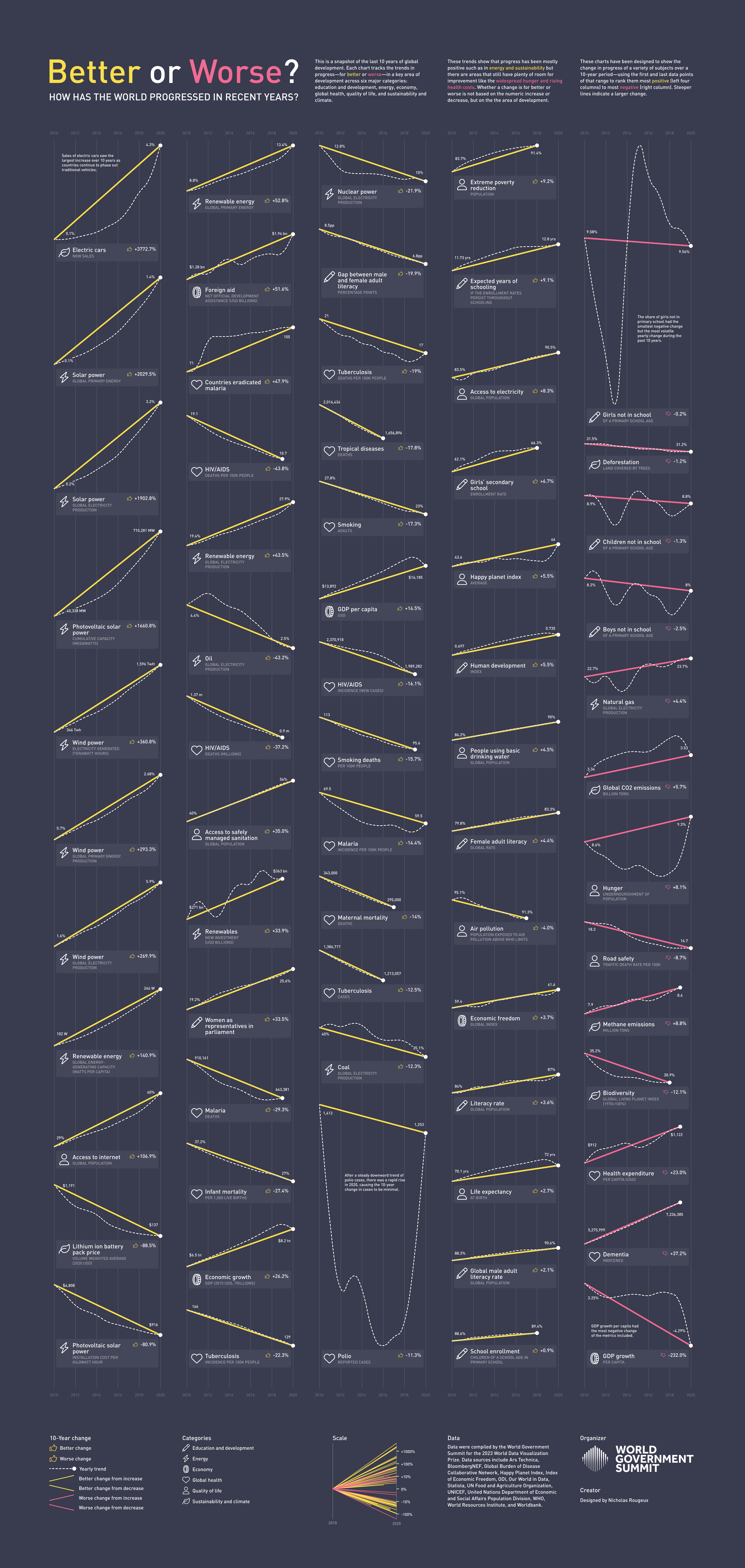
» Better or Worse (Nicholas Rougeux)
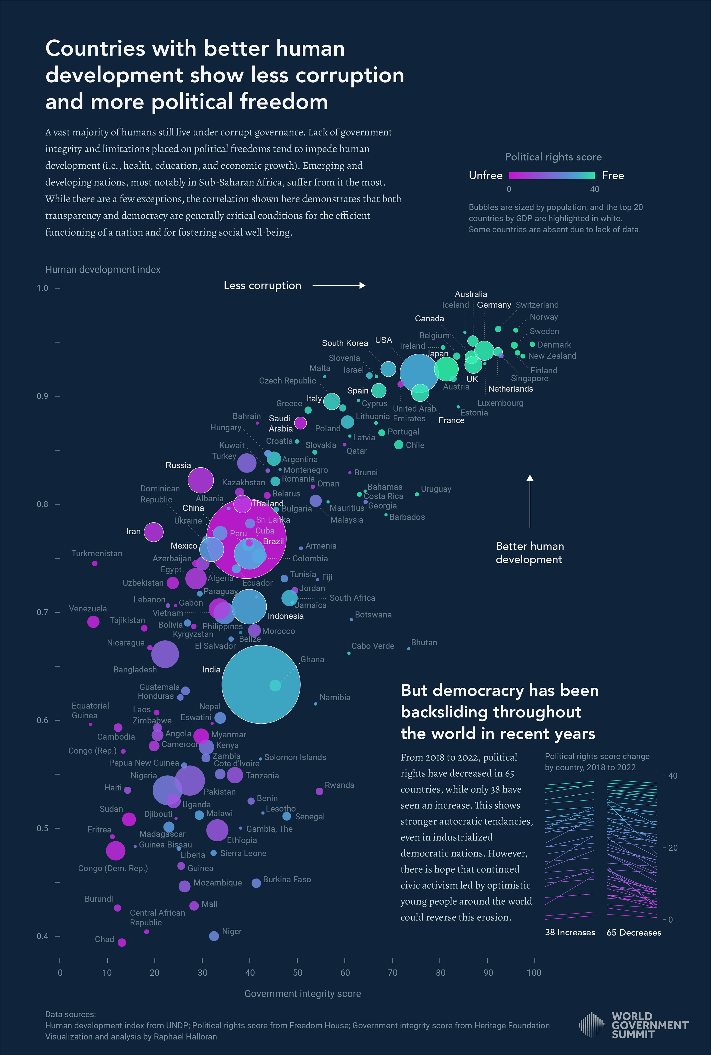
» Countries with better human development show less corruption and more political freedom (Raphael Halloran)
Grand Prize Winner – $25,000

This dynamic, multi-layered interactive dashboard invites users to focus on an area of interest — an income level, region, or country — and see how it compares to its counterparts across a wide range of metrics. You can randomize the data or choose an individual metric to answer specific questions. Fully explorable data! By Lindsey Poulter
A massive thank you to our judges, who agonised over the decision-making process – Alberto Cairo a journalist, designer, and scholar who teaches visualization at the University of Miami, Amanda Makulec a data visualization designer and executive director of The Data Visualisation Society, Gurman Bhatia an award-winning data journalist based in New Delhi, India, and David McCandless founder of Information is Beautiful.
Massive thanks also to the hundreds who entered. We were seriously impressed by the diversity and incredible creativity of all the entries. We’ll be showcasing a wider selection in the coming weeks.
In the meantime, you can check out
» the interactive longlist
» the poster longlist
» the shortlist
Keep an eye out for future dataviz competitions that we run, and maybe consider submitting your work to the Information is Beautiful Awards, which will launch later this year.
via Information is Beautiful
February 15, 2023 at 08:11PM